MDMFA Thesis Project
Jiquis Ward
Research
The journey for the Las Vegas Enforcers has come a long way from simply creating the brand story to having an entire brand playbook and outlook. The first few steps in the creation of the Enforcers brand were getting a simple theme that would be used as the basis of each element. In this case, team togetherness was the central theme that the team would be centered around. This is the close tight-knit relationship that is shared between the fans and the team itself. Through this central theme, a proper brand element was able to be constructed. These emotions often give off a feeling of collaboration to achieve one goal (Wharton, 2017). In the Enforcers case, it could be to win a championship or simply gain new fans. Nevertheless, team togetherness is used as the main catalyst for the overall brand.
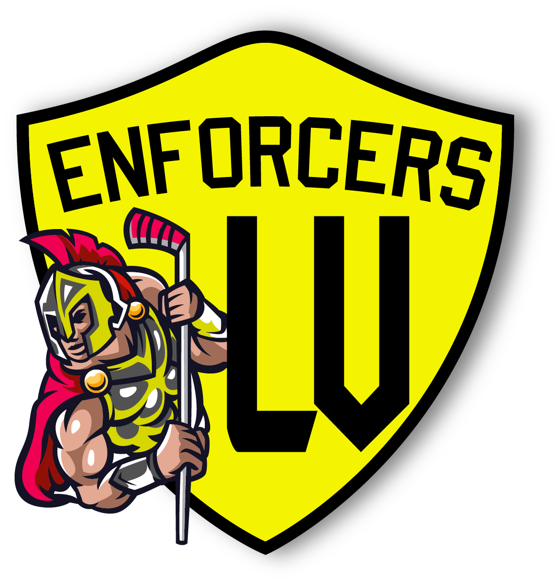
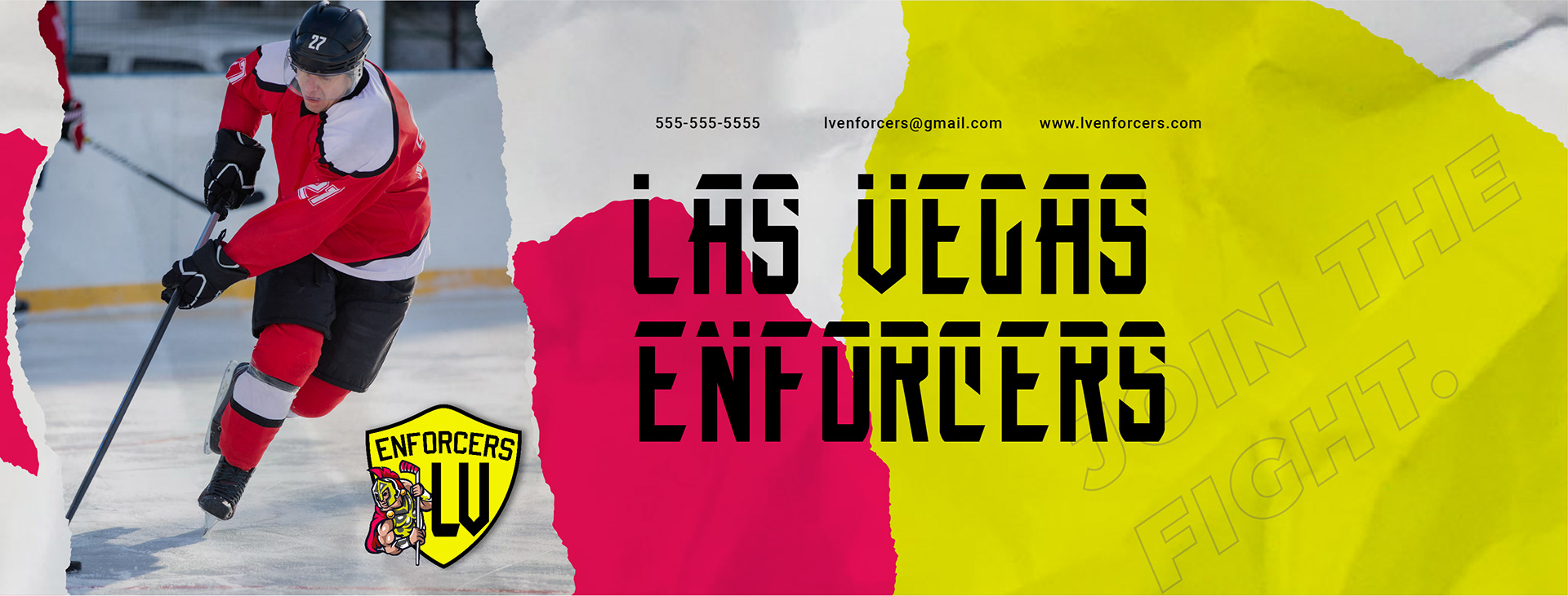
WHAT IS AN ENFORCER?
When the thought of an Enforcer is thought of, what is the main element that a consumer would think of? Some sort of warrior or aggressive element is usually tied with the term, and this allows for there to be many alterations of the term. While this could be tied to a military warrior, there are also enforces in hockey itself. These players are typically quick to fight and engage in action on the ice rink (Sportslingo, 2021). Therefore, combining a figure with a hockey stick makes the connection between a hockey "enforcer" and a warrior.
From this, one can come to the conclusion that this Enforcers hockey team has a direct connection to the type of name and players that are symbolic of the term. This is the main makeup of the logo with a warrior holding a hockey stick along with the team name across the top.
TYPOGRAPHY
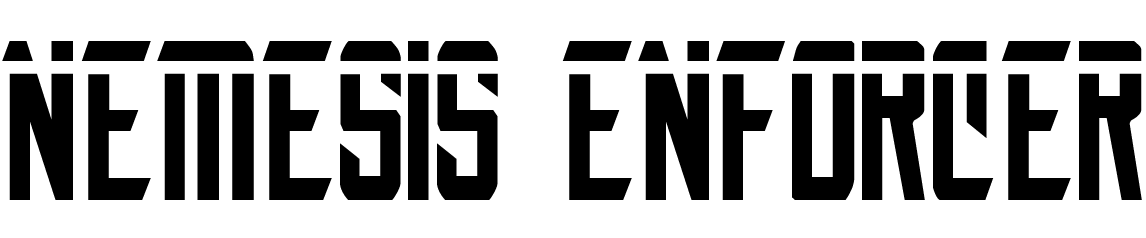
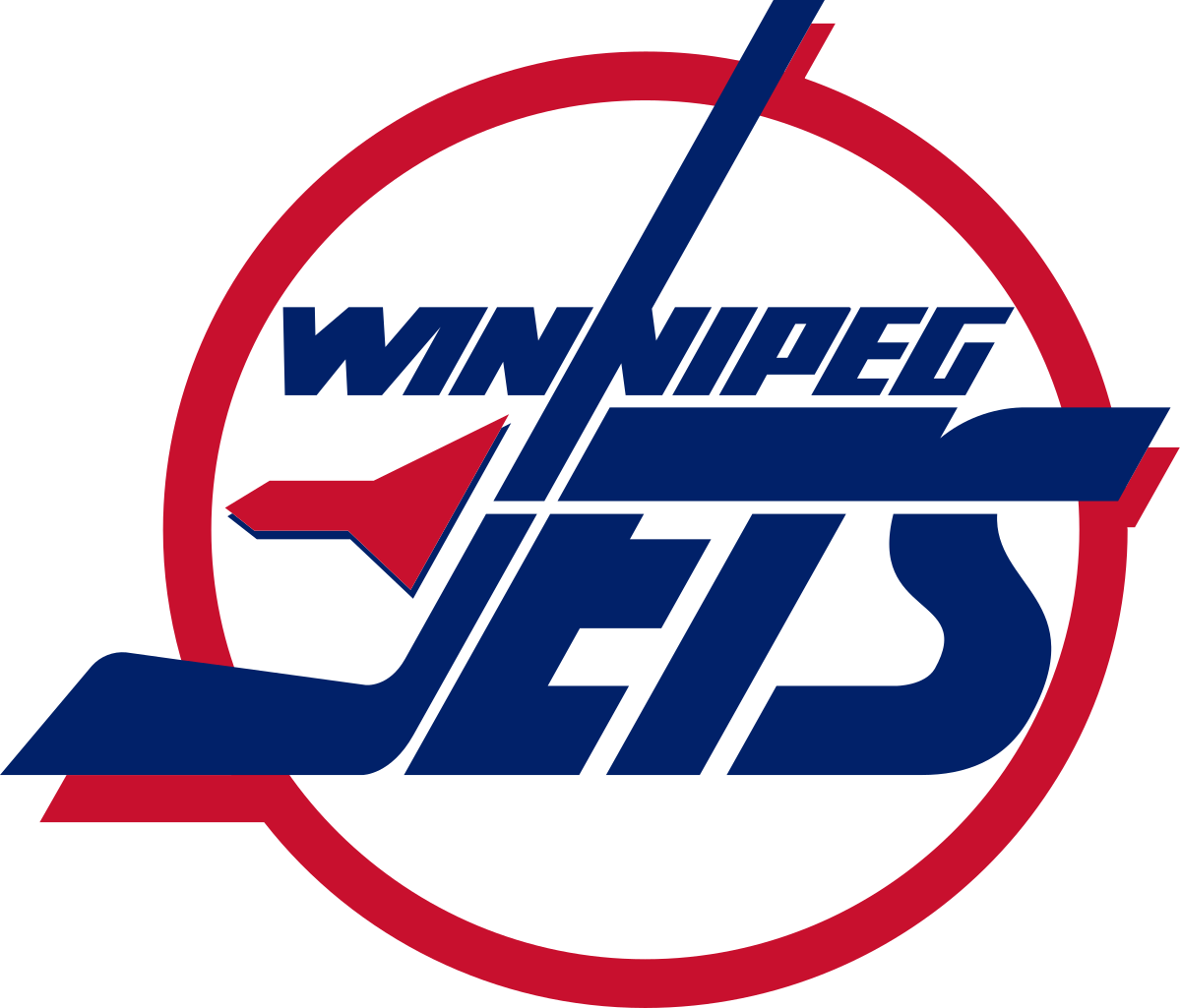
The main font choices used for the brand are derived from other typical sports logos and how they show both emotion and motion to the viewer. Establishing the correct text hierarchy allows for repetition that is best for keeping the brand consistent (Velarde, 2023). The old Winnipeg Jets logo was the main inspiration for the primary text used for the Enforcers. These font choices are very similar in the way they convey movement. It provides a sense of motion that keeps the brand busy.
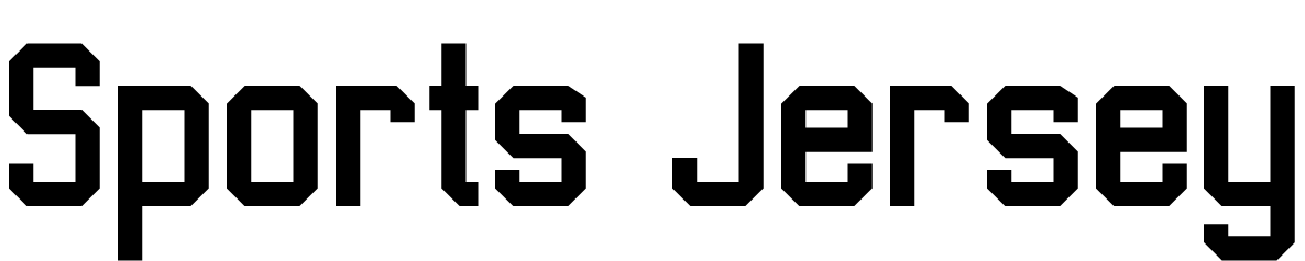
The secondary font is used just as frequently in numerous sports programs. The traditional, college sports jersey font is used to provide a sense of familiarity to that college and sport feel. It reminds many viewers that they all once came from the same place and mean similar things.
COLOR PALETTE
For the color palette, there are many factors that affect the choices made to properly symbolize the Enforcers. As it is related to the Enforcer's name itself, red symbolizes a bold and energetic feeling (Shmarel, 2022). It connects the feeling of hockey being an upbeat and physical sport. Red not only brings out emotion, but it is also very vibrant and contrasts well with many other colors that are involved.
As stated by Kimp, yellow evokes energy and is bright in contrast therefore it is easily seen by the viewer (Kimp, 2022). With the Vegas lights this blends well with the nightlife and is great for attracting an audience to the games.
UNIFORMS
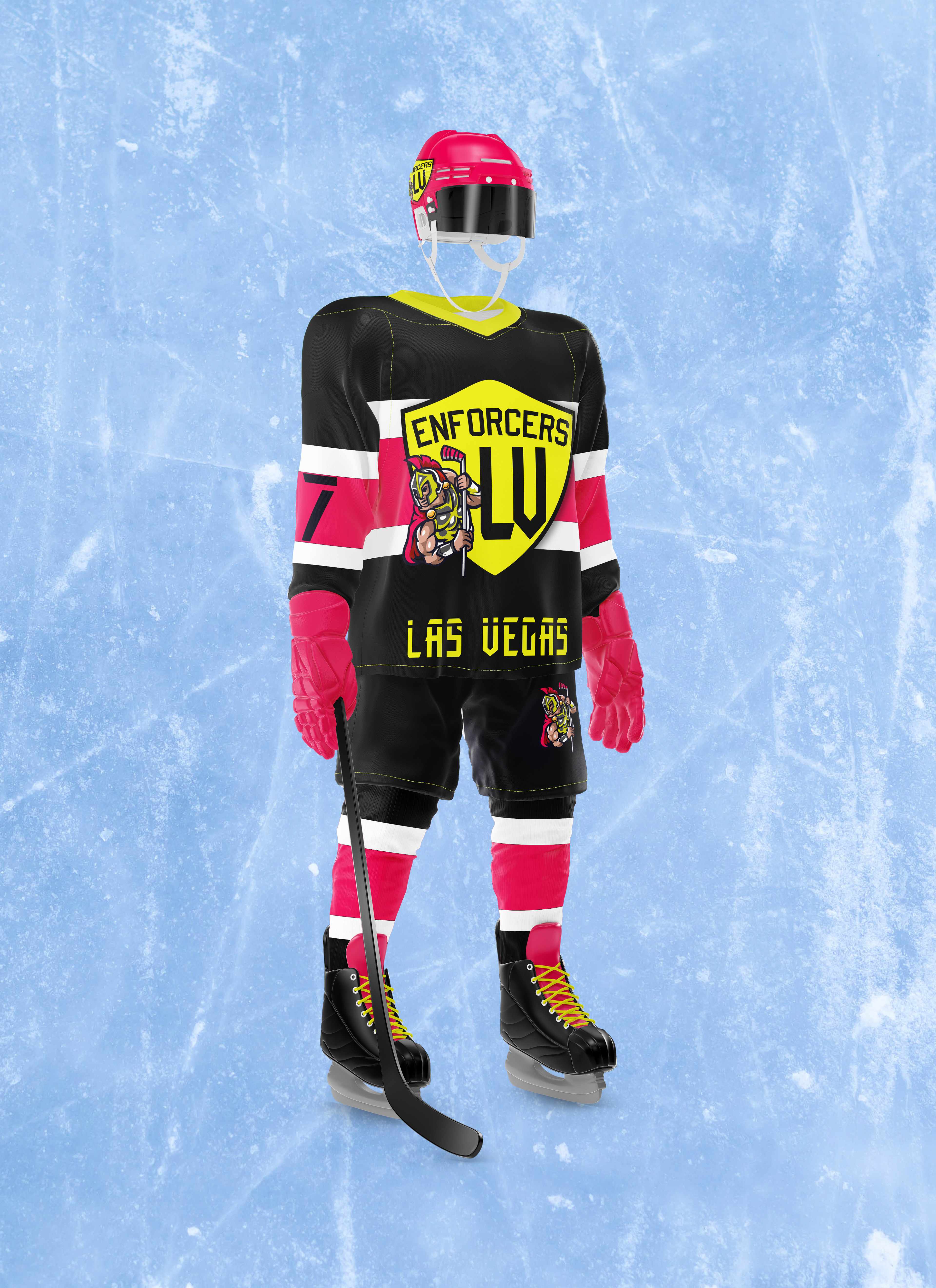
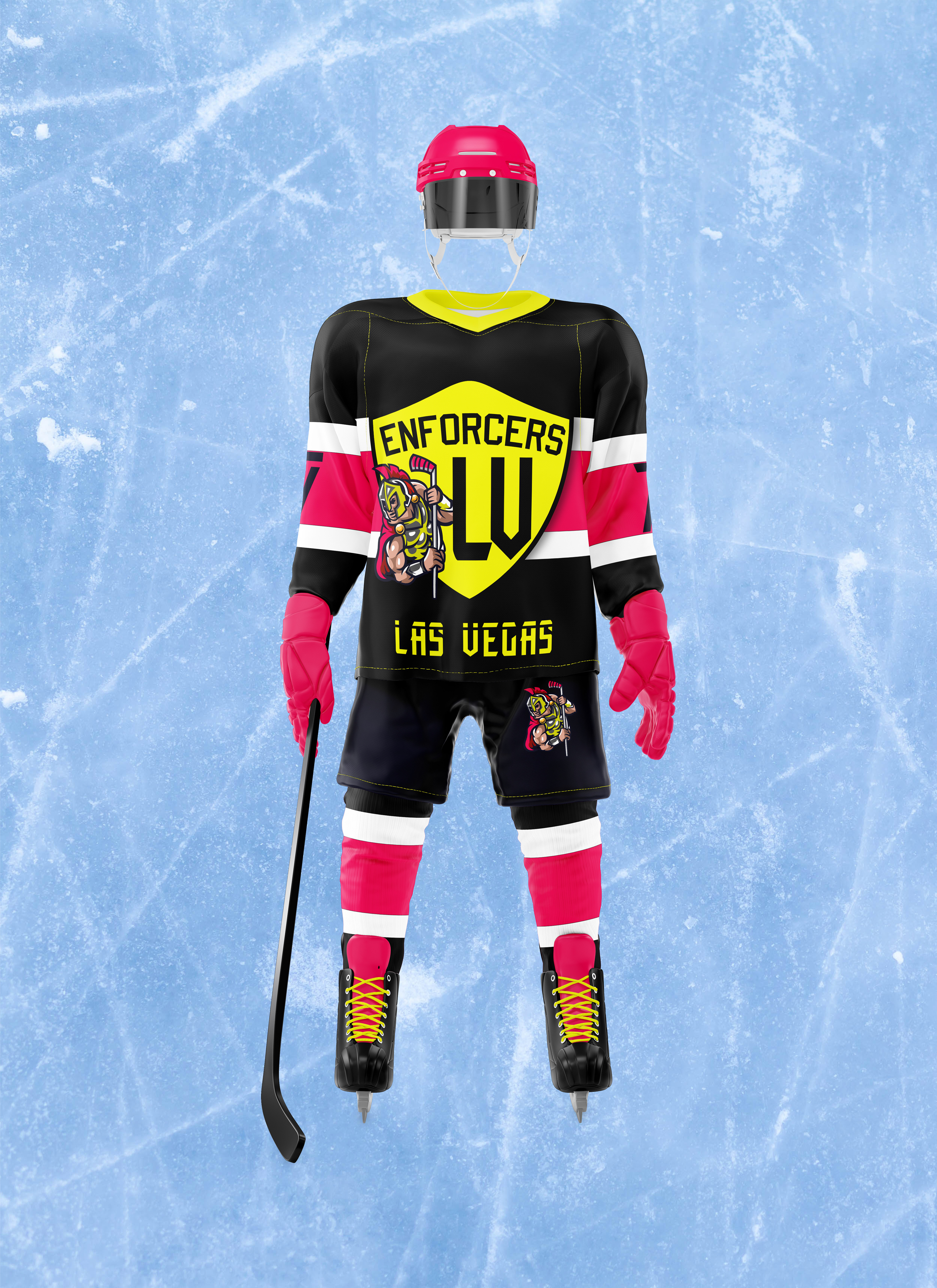
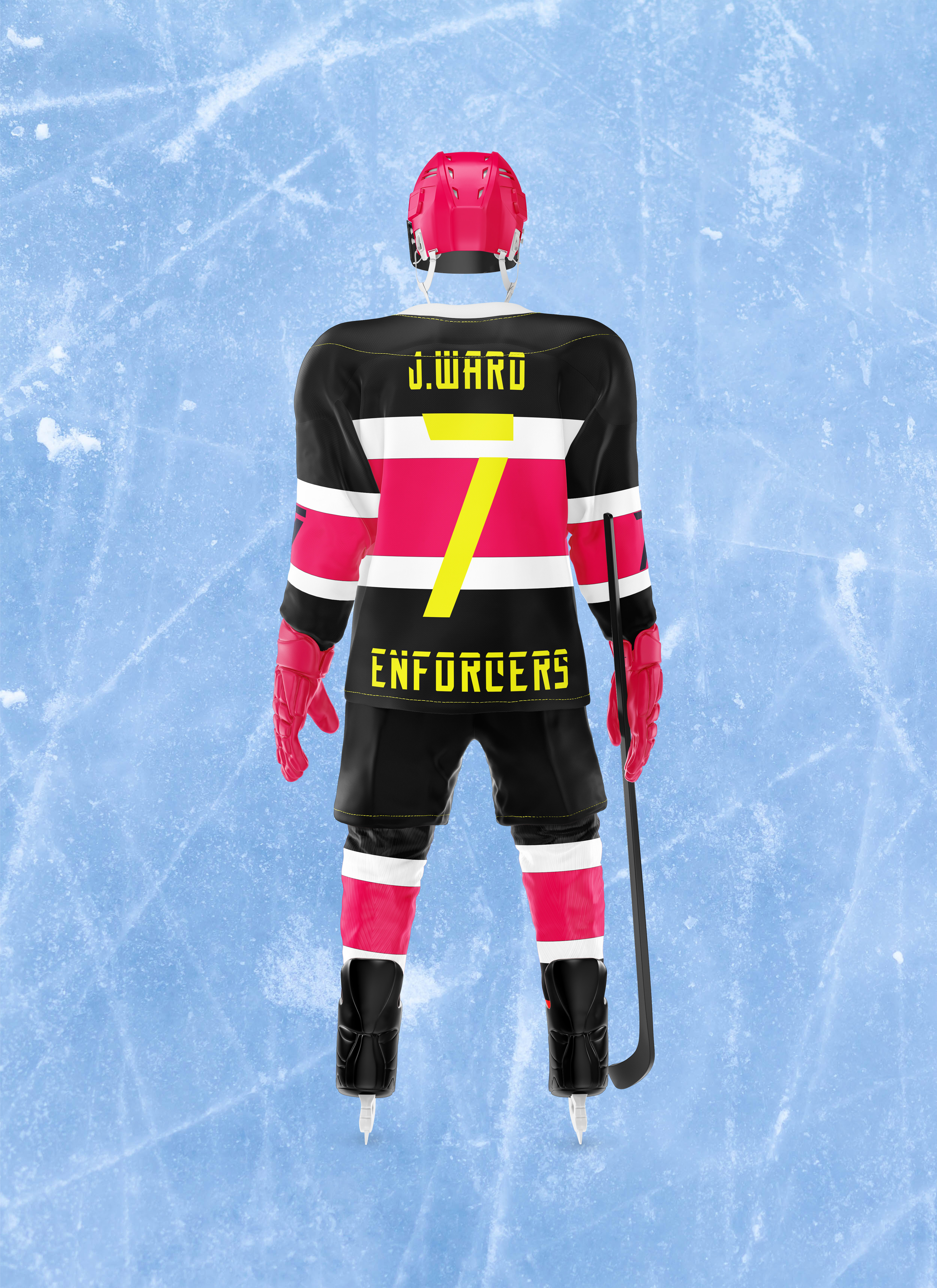
The importance of having a uniform design goes much deeper than just looking good and having something for the team to wear. According to Arctica, uniforms increase team camaraderie and tend to provide enthusiasm that is essential for motivation (Geoffrey, 2020). The black base of the uniform helps the other elements stand out more and fit the aesthetic of the Vegas nightlife, while the red and yellow contrast of the logo and stripes helps bring together the entire design. Having that sense of cohesiveness and unity makes for great results and adds to the theme of team togetherness that the Enforcers thrive to promote. It makes a statement that no one teammate is more important than the other and that was the inspiration behind the creation of uniforms (Rjacobs83, 2020).
SOCIAL MEDIA
Lastly, when creating the social media graphics there was one goal in mind and that was to stand out from the competition. The first order of business was figuring out the audience that would be targeted when coming up with the different designs (Decker, 2020). The target audience included tourists who visited Las Vegas and blue-class workers already present in the city. Defining the brand guidelines with the brand vision board was very helpful in determining what would be useful for the designs.
Having a set design system and protocol helps others get to know the brand more easily and helps new customers get familiar. An example of this concept is the Nemesis Enforcer font that It used throughout these graphics. Repeatedly using font choices and styles that fans are familiar with gets fans amicable with the brand without even seeing the name. Getting to know a company on a much deeper level produces great results (Henderson, 2021).